열심히 코딩 하숭!
데이터 시각화(Matplotlib, Seaborn) | 2주차 | 파이썬 머신러닝 완벽가이드 본문
* 해당 글은 inflearn의 강의 '[개정판] 파이썬 머신러닝 완벽가이드'를 정리한 글입니다.
회색 - 강의 제목
노란색, 주황색 - 강조
민트색 - 발표할 때 짚고 넘어가면 좋을 것 같은 부분
1일
[0:03:04] 시각화를 시작하며
- 시각화 몰라도 너무 스트레스 받지 말자!
[0:11:57] Matplotlib과 Seaborn 개요 및 비교
통계적인(statistical) 시각화
- Seaborn
- 히스토그램, 바이올린 플롯, 산포도, 바차트, 분위, 상관 히트맵
중간
- Matplotlib
업무 분석(business analysis) 시각화
- Plotly
- 바차트, 라인 플롯, 파이 차트, 영역 차트, 산포도, 방사형 차트, 버블 차트, 깔때기 차트
맷플롯립(Matplotlib)
- 파이썬 시각화에 큰 공헌을 한 시각화 라이브러리
- 단점: 직관적이지 못한 API, 익숙해지는 데 많은 시간이 필요
시본(Seaborn)
- 맷플롯립을 기본으로 하는데, 이보다 적은 양의 코딩으로 수려한 시각화 플롯을 제공
- pandas와 쉽게 연동됨
- 그래도, 시본을 잘 활용하려면 맷플롯립을 어느정도는 알고 있어야 함
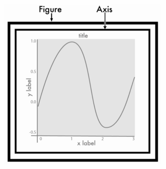
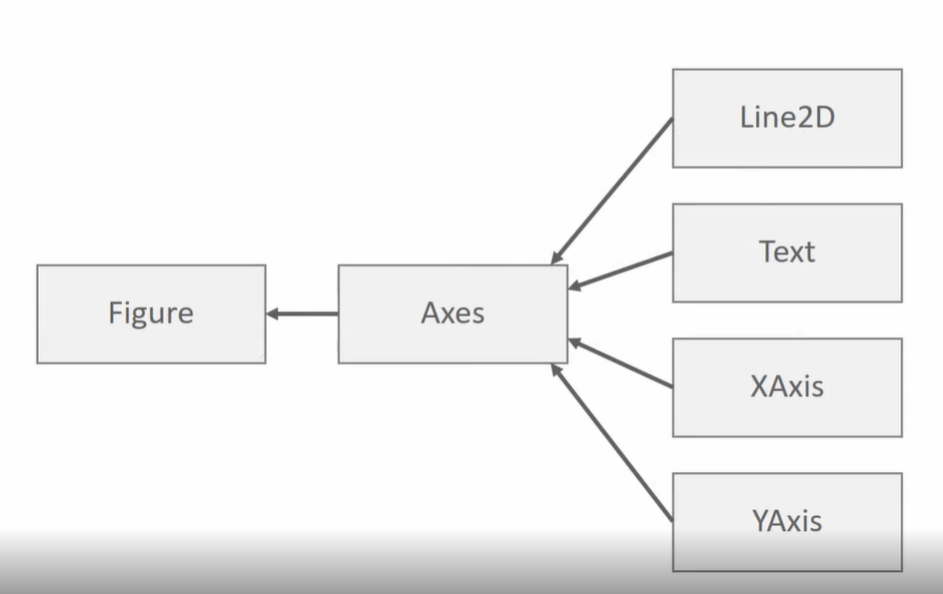
[0:11:30] Matplotlib의 이해 - Figure와 Axes
matplotlib.pyplot 모듈
- MATLAB 스타일의 interface를 가짐
Figure
- 그림을 그리기 위한 Canvas 역할
- 그림판의 크기 등을 조절
Axes
- 실제 그림을 그리는 메소드들을 가짐
- x축, y축, title 등의 속성을 설정
- Axis의 복수형이 Axes
[0:11:32] Matplotlib Figure와 Axes 실습
기본 그래프 코드
import matplotlib.pyplot as plt
#%matplotlib inline -> jupyter notebook이면 생략 가능

plt. figure(figsize=(10,4)) # Figure 객체의 크기 지정
plt.plot([1, 2, 3], [2, 4, 6]) # Axes.plot()함수를 호출하여 그림을 그림
plt.title("Hello plot") # Axes.set_title()함수로 title을 설정함
#plt.show() # Figure.show()를 호출하여 그림을 나타냄 -> jupyter notebook이면 생략 가능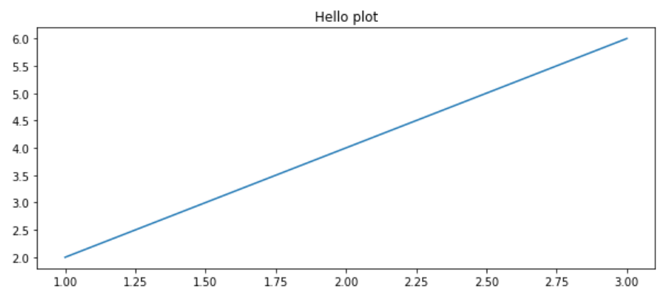
Figure 설정
figure = plt.figure(figsize=(10, 4))-> 크기 지정
plt.figure(figsize=(8,6), facecolor='yellow') # figure의 색 설정
plt.plot([1, 2, 3], [2, 4, 6])
plt.title("Hello plot")
plt.show()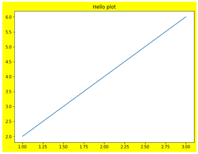
-> figure에만 yellow 색이 적용됨. axes가 그 위에 덮고있는 구조라서, 그래프에는 적용이 되지 않음.
Axes 보이기
ax = plt.axes()
print(type(ax)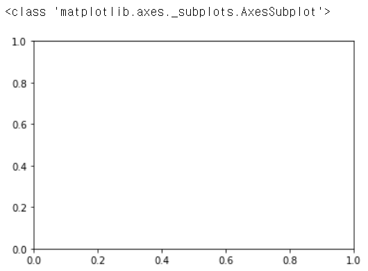
subplot
- 여러개의 plot을 가지는 figure 만들기
fig, (ax1, ax2) = plt.subplots(nrows=1, ncols=2, figsize=(10, 6))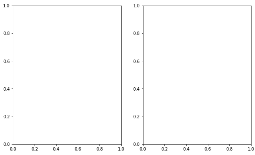
[0:13:59] Matplotlib의 여러 구성 요소를 이용한 시각화 실습 - 01
리스트, numpy 데이터를 이용한 plot
import numpy as np

x_value = [1, 2, 3, 4]
y_value = [2, 4, 6, 8]
x_value = np.array([1, 2, 3, 4])
y_value = np.array([2, 4, 6, 8])

# 입력값으로 파이썬 리스트, numpy array 가능. x축값과 y축값은 모두 같은 크기를 가져야 함.
plt.plot(x_value, y_value)
-> 입력값으로 파이썬 리스트, numpy array 사용 가능
-> x축값과 y축값은 모두 같은 크기를 가져야 함.
DataFrame 데이터를 이용한 plot
import pandas as pd

df = pd.DataFrame({'x_value':[1, 2, 3, 4],
                   'y_value':[2, 4, 6, 8]})

# 입력값으로 pandas Series 및 DataFrame도 가능.
plt.plot(df['x_value'], df['y_value'])
-> 입력값으로 pandas Series 및 DataFrame도 사용 가능
plot 색 변경
plt.plot(x_value, y_value, color='green')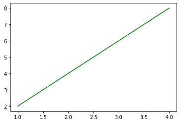
-> plot 색 변경
그래프 style 변경
plt.plot(x_value, y_value, color='red', marker='o', linestyle='dashed', linewidth=2, markersize=12)-> 다섯개의 인자들 많이 쓰이니까 알고있기!
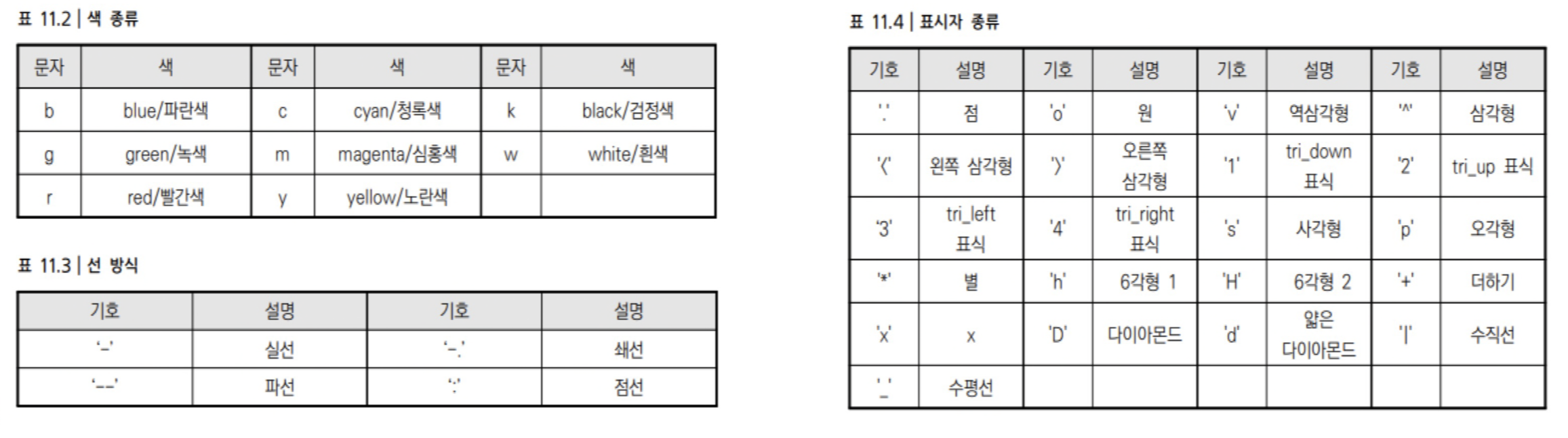
-> marker : 표시자 / linestyle : 선 방식 / color : 색 종류
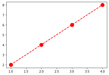
xlabel(), ylabel()
- x축, y축 label 지정
plt.plot(x_value, y_value, color='red', marker='o', linestyle='dashed', linewidth=2, markersize=12)
plt.xlabel('x axis')
plt.ylabel('y axis')
plt.show()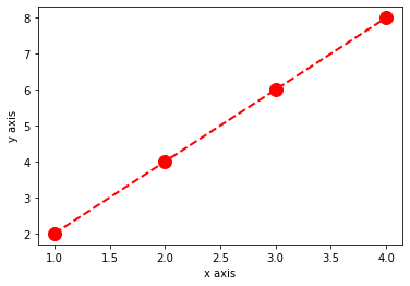
xticks(), yticks()
- x, y tick 값 회전하기
x_value = np.arange(0, 100)
y_value = 2*x_value

plt.plot(x_value, y_value, color='green')
plt.xlabel('x axis')
plt.ylabel('y axis')

plt.xticks(ticks=np.arange(0, 100, 5), rotation=90) # x를 5 단위로 나타내기
plt.yticks(rotation=45)

plt.title('Hello plot')
plt.show()
xlim(), ylim()
- x, y축의 범위를 제한
x_value = np.arange(0, 100)
y_value = 2*x_value

plt.plot(x_value, y_value, color='green')
plt.xlabel('x axis')
plt.ylabel('y axis')

# x축값을 0에서 50으로, y축값을 0에서 100으로 제한.
plt.xlim(0, 50)
plt.ylim(0, 100)

plt.title('Hello plot')

plt.show()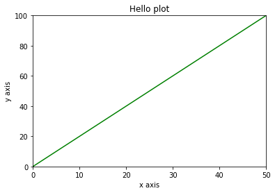
legend()
- 범례 표기하기
x_value = np.arange(1, 100)
y_value = 2*x_value

plt.plot(x_value, y_value, color='green', label='temp') # 주의: 그림 그리는 plot에 label 이름을 지정하기!
plt.xlabel('x axis')
plt.ylabel('y axis')

plt.legend() # 범례 표현

plt.title('Hello plot')

plt.show()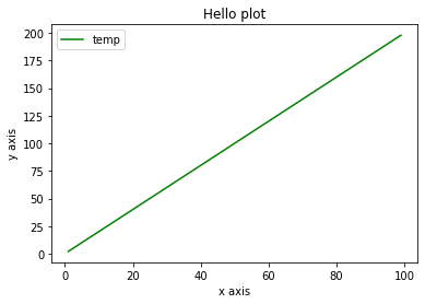
[0:12:49] Matplotlib의 여러 구성 요소를 이용한 시각화 실습 - 02
하나의 Axes에 여러개의 그래프 그리기
- 같은 유형의 그래프
x_value_01 = np.arange(1, 100)
#x_value_02 = np.arange(1, 200)
y_value_01 = 2*x_value_01
y_value_02 = 4*x_value_01

plt.plot(x_value_01, y_value_01, color='green', label='temp_01')
plt.plot(x_value_01, y_value_02, color='red', label='temp_02')
plt.xlabel('x axis')
plt.ylabel('y axis')

plt.legend()

plt.title('Hello plot')

plt.show()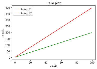
-> 주의 : x가 같아야 함
-> x가 달라도 됨!!!
import numpy as np
import matplotlib.pyplot as plt

x_value_01 = np.arange(1, 100)
x_value_02 = np.arange(1, 200)
y_value_01 = 2*x_value_01
y_value_02 = 4*x_value_02

plt.plot(x_value_01, y_value_01, color='green', label='temp_01')
plt.plot(x_value_02, y_value_02, color='red', label='temp_02')
plt.xlabel('x axis')
plt.ylabel('y axis')

plt.legend()

plt.title('Hello plot')

plt.show()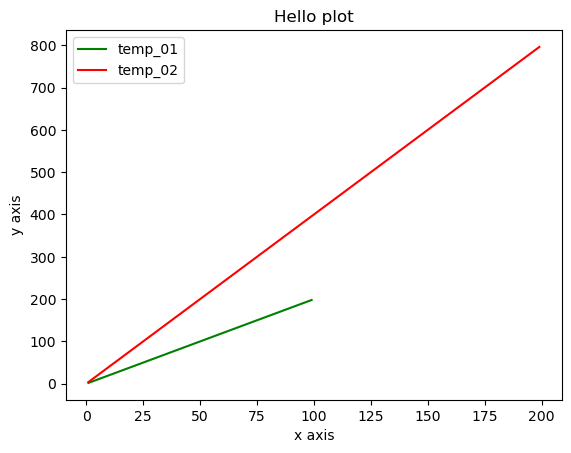
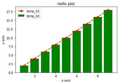
- 다른 유형의 그래프
x_value_01 = np.arange(1, 10)
#x_value_02 = np.arange(1, 200)
y_value_01 = 2*x_value_01
y_value_02 = 4*x_value_01

plt.plot(x_value_01, y_value_01, color='red', marker='o', linestyle='dashed', linewidth=2, markersize=6, label='temp_01')
plt.bar(x_value_01, y_value_01, color='green', label='temp_02')
plt.xlabel('x axis')
plt.ylabel('y axis')

plt.legend()

plt.title('Hello plot')

plt.show()
Axes에서 직접 작업
- plt와 함수명의 차이가 있음
figure = plt.figure(figsize=(10, 6))
ax = plt.axes()

ax.plot(x_value_01, y_value_01, color='red', marker='o', linestyle='dashed', linewidth=2, markersize=6, label='temp_01')
ax.bar(x_value_01, y_value_01, color='green', label='temp_02')
ax.set_xlabel('x axis')
ax.set_ylabel('y axis')

ax.legend() # set_legend()가 아니라 legend()임.
ax.set_title('Hello plot')

plt.show()
여러개의 subplots을 가지는 figure를 생성하고, 개별 그래프를 각각 시각화
x_value_01 = np.arange(1, 10)
x_value_02 = np.arange(1, 20)
y_value_01 = 2 * x_value_01
y_value_02 = 2 * x_value_02

fig, (ax_01, ax_02) = plt.subplots(nrows=1, ncols=2, figsize=(12, 6))

ax_01.plot(x_value_01, y_value_01, color='red', marker='o', linestyle='dashed', linewidth=2, markersize=6, label='temp_01')
ax_02.bar(x_value_02, y_value_02, color='green', label='temp_02')

ax_01.set_xlabel('ax_01 x axis')
ax_02.set_xlabel('ax_02 x axis')

ax_01.legend()
ax_02.legend()

#plt.legend()
plt.show()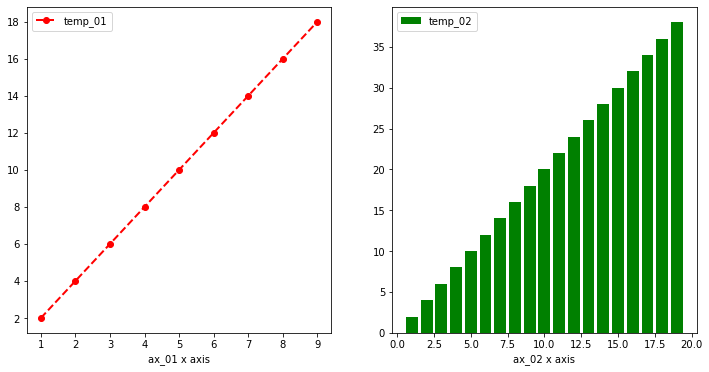
- 아래도 같은 결과를 도출해낼 수 있음
import numpy as np

x_value_01 = np.arange(1, 10)
x_value_02 = np.arange(1, 20)
y_value_01 = 2 * x_value_01
y_value_02 = 2 * x_value_02

fig, ax = plt.subplots(nrows=1, ncols=2, figsize=(12, 6))

ax[0].plot(x_value_01, y_value_01, color='red', marker='o', linestyle='dashed', linewidth=2, markersize=6, label='temp_01')
ax[1].bar(x_value_02, y_value_02, color='green', label='temp_02')

ax[0].set_xlabel('ax[0] x axis')
ax[1].set_xlabel('ax[1] x axis')

ax[0].legend()
ax[1].legend()

#plt.legend()
plt.show()
- 응용 : 2개 이상일 때는 2차원배열로 표시
import numpy as np

x_value_01 = np.arange(1, 10)
x_value_02 = np.arange(1, 20)
y_value_01 = 2 * x_value_01
y_value_02 = 2 * x_value_02

fig, ax = plt.subplots(nrows=2, ncols=2, figsize=(12, 6))

ax[0][0].plot(x_value_01, y_value_01, color='red', marker='o', linestyle='dashed', linewidth=2, markersize=6, label='temp_01')
ax[0][1].bar(x_value_02, y_value_02, color='green', label='temp_02')
ax[1][0].plot(x_value_01, y_value_01, color='green', marker='o', linestyle='dashed', linewidth=2, markersize=6, label='temp_03')
ax[1][1].bar(x_value_02, y_value_02, color='red', label='temp_04')

ax[0][0].set_xlabel('ax[0][0] x axis')
ax[0][1].set_xlabel('ax[0][1] x axis')
ax[1][0].set_xlabel('ax[1][0] x axis')
ax[1][1].set_xlabel('ax[1][1] x axis')

ax[0][0].legend()
ax[0][1].legend()
ax[1][0].legend()
ax[1][1].legend()

#plt.legend()
plt.show()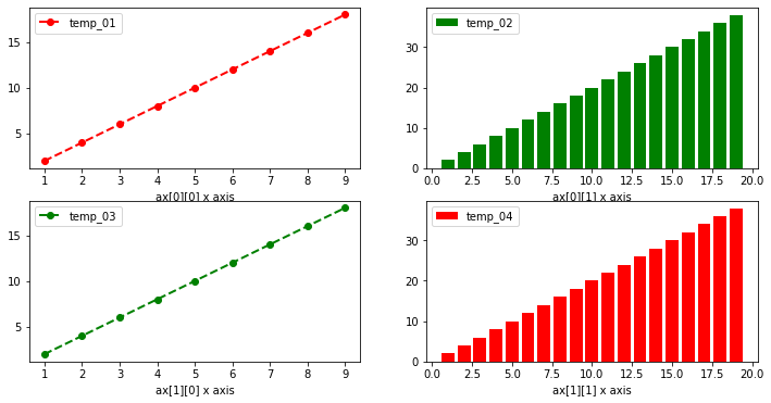
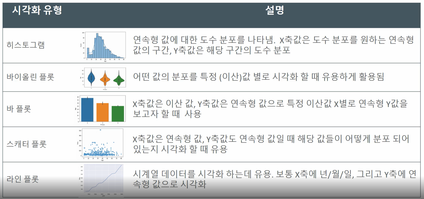
[0:13:33] 정보의 종류에 따른 시각화 유형
차트 유형
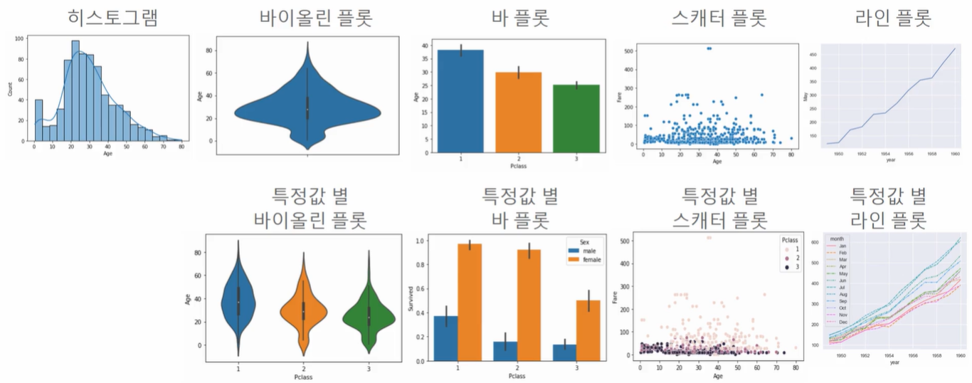
- 히스토그램 : 많이 쓰임, 분포를 알 수 있음
- 바이올린 플롯 : 히스토그램을 기하학적으로 표현
- 바 플롯 : 수를 표기 (특정값 별 바 플롯 : 한 번에 3개의 값을 비교해볼 수 있음!)
- 스캐터 플롯 : 몰려있는 정도를 알 수 있음, 튀는 데이터 값도 찾아낼 수 있음
- 라인 플롯 : 시계열 데이터 사용할 때 주로 씀
정보의 종류에 따른 시각화 유형 <- 중요!
2일
[0:08:18] Seaborn의 Axis 레벨 함수와 Figure 레벨 함수의 이해
Seaborn 소개
- Matplotlib보다 쉽고 간편하다
- pandas와 쉬운 연동이 가능하다
- Matplotlib를 어느정도 알고는 있어야 한다
Axes level vs Figure level
- Axes level : 개별 Axes가 plot에 대한 주도적인 역할을 수행한다
- Figure level : FacetGrid라는 클래스에서 개별 Axes 기반의plot을 그릴 수 있는 기능을 통제함?
-> 자동으로 쪼개준다, 아무튼 더 편하다
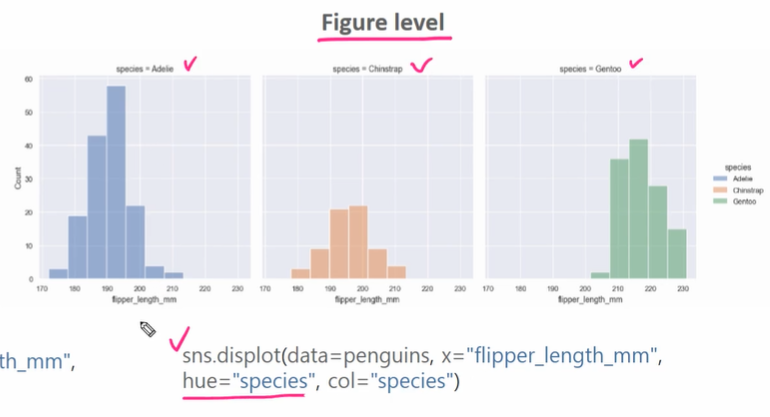
Figure level
- 여러 개의 subplot에서의 plot을 매우 쉽게 생성할 수 있다
- subplot에서 축의 명칭, 타이틀을 별도로 지정하지 않아도, 자동으로 인지하여 생성한다
- 단점 : 새로운 API에 적응해야 함 (강의에서 잘 안 씀! 강의에서는 Axes level 위주로.), 커스터마이징 변경 적용이 어려움
[0:15:24] Seaborn 히스토그램 시각화 실습
Histogram
- 연속값에 대한 구간별 도수 분포를 시각화
Matplotlib에서 Histogram 출력
### matplotlib histogram
import matplotlib.pyplot as plt

plt.hist(titanic_df['Age'])
#plt.show()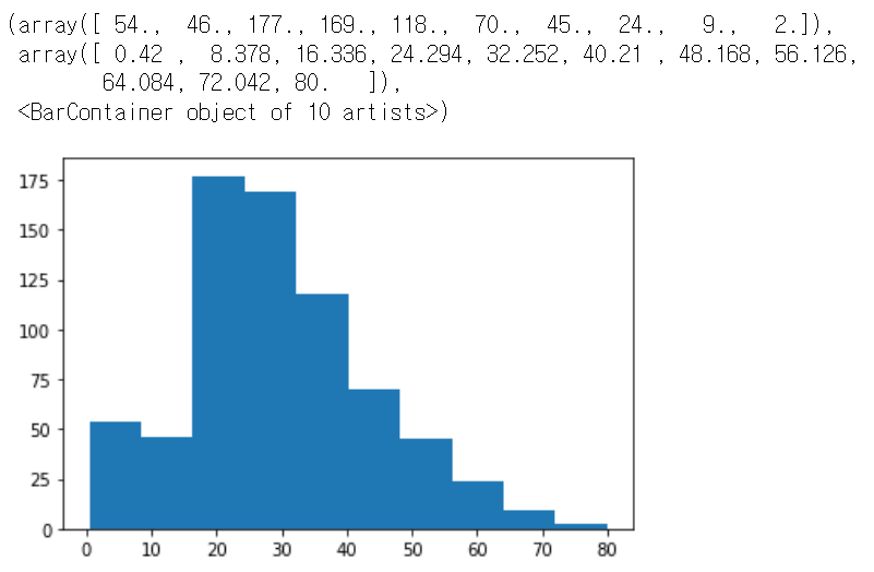
Pandas에서 Histogram 출력
# Pandas 에서 hist 함수를 바로 호출할 수 있음.
titanic_df['Age'].hist()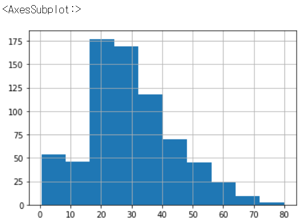
Seaborn에서 Histogram 출력
- distplot() : 예전 histogram(지금은 잘 안 쓰임)
- histplot() : Axes level
- displot() : figure level
displot() : 예전 histogram(지금은 잘 안 쓰임, deprecated)
import seaborn as sns
#import warnings
#warnings.filterwarnings('ignore')

sns.distplot(titanic_df['Age'], bins=10, kde=False, rug=True)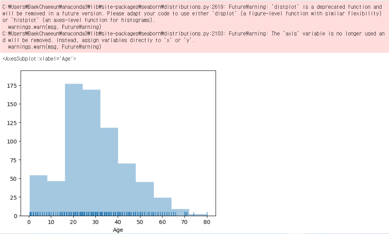
histplot() : Axes level
- rug 속성 없음
### seaborn histogram
import seaborn as sns

# seaborn에서도 figure로 canvas의 사이즈를 조정
# plt.figure(figsize=(10, 6))
# Pandas DataFrame의 컬럼명을 자동으로 인식해서 xlabel값을 할당. ylabel 값은 histogram일때 Count 할당.
sns.histplot(titanic_df['Age'], kde=True)
#plt.show()
아래와 같이 사용할 수도 있음
plt.figure(figsize=(12, 6))
sns.histplot(x='Age', data=titanic_df, kde=True, bins=30)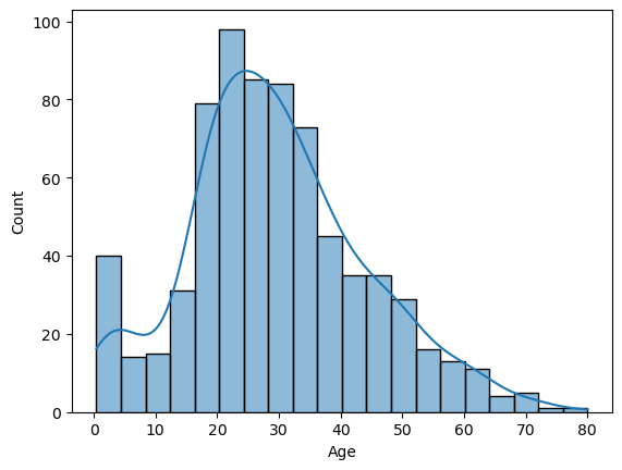
displot() : figure level
import seaborn as sns

# seaborn의 figure레벨 그래프는 plt.figure로 figure 크기를 조절할 수 없습니다.
#plt.figure(figsize=(4, 4))
# Pandas DataFrame의 컬럼명을 자동으로 인식해서 xlabel값을 할당. ylabel 값은 histogram일때 Count 할당.
sns.displot(titanic_df['Age'], kde=True, rug=True, height=4, aspect=2) # aspect : 가로 세로의 비율
#plt.show()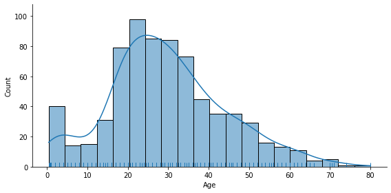
[0:08:38] Seaborn Bar 플롯 시각화 실습 - 01
countplot()
- 카테고리 값에 대한 건수를 표현
sns.countplot(x='Pclass', data=titanic_df)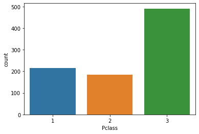
barplot()
- x축은 이산값 (주로 category 값)
- y축은 연속값 (y값의 평균/총합)
#plt.figure(figsize=(10, 6))
# 자동으로 xlabel, ylabel을 x입력값, y입력값으로 설정.
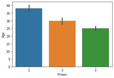
sns.barplot(x='Pclass', y='Age', data=titanic_df)-> Pclass에 따른 Age의 평균을 나타냄
sns.barplot(x='Pclass', y='Survived', data=titanic_df)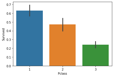
- 수직 barplot에 y축을 문자값으로 설정하면 자동으로 수평 barplot으로 변환
sns.barplot(x='Pclass', y='Sex', data=titanic_df)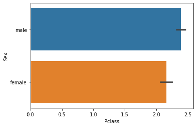
- confidence interval(신뢰구간)을 없애고, color를 통일.
sns.barplot(x='Pclass', y='Survived', data=titanic_df, ci=None, color='green')
- 평균이 아니라 총합으로 표현. estimator=sum
sns.barplot(x='Pclass', y='Survived', data=titanic_df, ci=None, estimator=sum)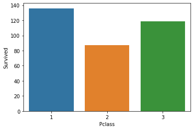
[0:10:58] Seaborn Bar 플롯 시각화 실습 - 02
hue 인자
- 하나의 정보를 또 추가할 수 있음
# 아래는 Pclass가 X축값이며 hue파라미터로 Sex를 설정하여 개별 Pclass 값 별로 Sex에 따른 Age 평균 값을 구함.
sns.barplot(x='Pclass', y='Age', hue='Sex', data=titanic_df)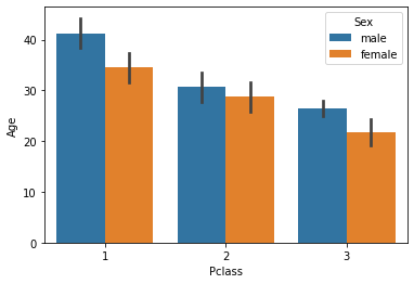
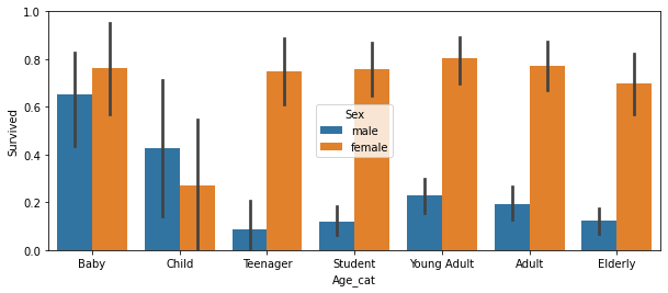
- Age_cat이라는 속성을 새로 추가하여 실습
# 나이에 따라 세분화된 분류를 수행하는 함수 생성.
def get_category(age):
    cat = ''
    if age <= 5: cat = 'Baby'
    elif age <= 12: cat = 'Child'
    elif age <= 18: cat = 'Teenager'
    elif age <= 25: cat = 'Student'
    elif age <= 35: cat = 'Young Adult'
    elif age <= 60: cat = 'Adult'
    else : cat = 'Elderly'

    return cat

# lambda 식에 위에서 생성한 get_category( ) 함수를 반환값으로 지정.
# get_category(X)는 입력값으로 ‘Age’ 칼럼 값을 받아서 해당하는 cat 반환
titanic_df['Age_cat'] = titanic_df['Age'].apply(lambda x : get_category(x))
plt.figure(figsize=(10, 4))
order_columns = ['Baby', 'Child', 'Teenager', 'Student', 'Young Adult', 'Adult', 'Elderly']
sns.barplot(x='Age_cat', y='Survived', hue='Sex', data=titanic_df, order=order_columns)
-> order_columns에 주어진 순서대로 그래프에 표시할 수 있음
sns.barplot(x='Sex', y='Survived', hue='Age_cat', data=titanic_df)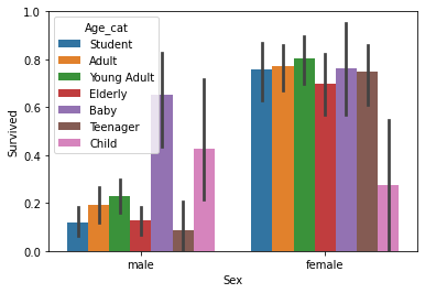
- orient= 'h'를 하면 수평 바 플롯을 그림. 단 이번엔 y축값이 이산형 값이어야 함!
sns.barplot(x='Survived', y='Pclass', data=titanic_df, orient='h')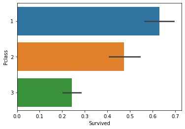
[0:07:01] Seaborn Violin 플롯 실습
Violin plot
- 연속값의 분포도를 시각화
- 중심에서 4분위를 알 수 있다
# Age 컬럼에 대한 연속 확률 분포 시각화
sns.violinplot(y='Age', data=titanic_df)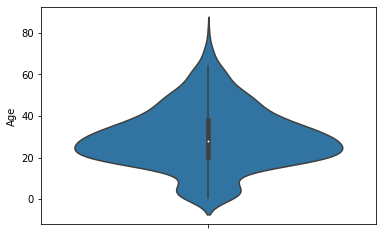
# x축값인 Pclass의 값별로 y축 값인 Age의 연속분포 곡선을 알 수 있음.
sns.violinplot(x='Pclass', y='Age', data=titanic_df)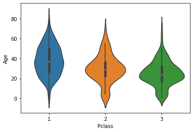
# x축인 Sex값 별로 y축값이 Age의 값 분포를 알 수 있음.
sns.violinplot(x='Sex', y='Age', data=titanic_df)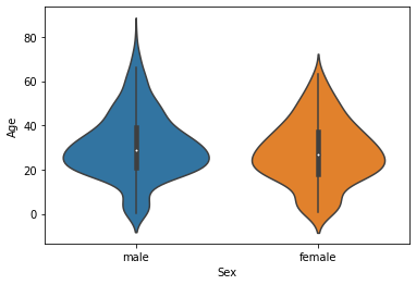
[0:18:39] Seaborn에서 subplots을 활용한 시각화 기법 익히기
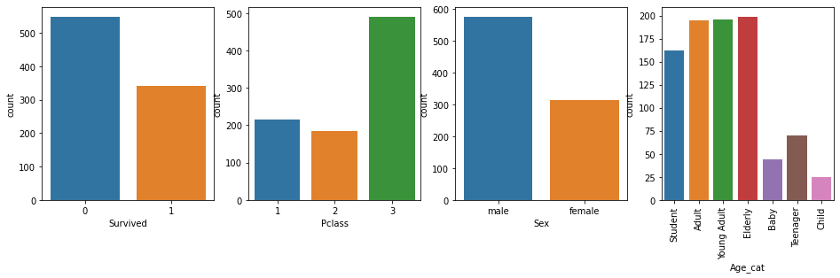
Subplot을 활용해 시각화하기
- 주요 category성 칼럼의 건수를 시각화
cat_columns = ['Survived', 'Pclass', 'Sex', 'Age_cat']

# nrows는 1이고 ncols는 컬럼의 갯수만큼인 subplots을 설정.
fig, axs = plt.subplots(nrows=1, ncols=len(cat_columns), figsize=(16, 4))

for index, column in enumerate(cat_columns): # enumerate: index랑 column명이 같이 나옴
    print('index:', index)
    # seaborn의 Axes 레벨 function들은 ax인자로 subplots의 어느 Axes에 위치할지 설정.
    sns.countplot(x=column, data=titanic_df, ax=axs[index])
    if index == 3:
        # plt.xticks(rotation=90)으로 간단하게 할수 있지만 Axes 객체를 직접 이용할 경우 API가 상대적으로 복잡.
        axs[index].set_xticklabels(axs[index].get_xticklabels(), rotation=90)
-> 마지막 그래프의 x축 label을 rotate함!
- 주요 category성 컬럼별로 컬럼값에 따른 생존율 시각화
cat_columns = ['Pclass', 'Sex', 'Age_cat']

# nrows는 1이고 ncols는 컬럼의 갯수만큼인 subplots을 설정.
fig, axs = plt.subplots(nrows=1, ncols=len(cat_columns), figsize=(16, 4))

for index, column in enumerate(cat_columns):
    print('index:', index)
    # seaborn의 Axes 레벨 function들은 ax인자로 subplots의 어느 Axes에 위치할지 설정.
    sns.barplot(x=column, y='Survived', data=titanic_df, ax=axs[index])
    if index == 2:
        # plt.xticks(rotation=90)으로 간단하게 할수 있지만 Axes 객체를 직접 이용할 경우 API가 상대적으로 복잡.
        axs[index].set_xticklabels(axs[index].get_xticklabels(), rotation=90)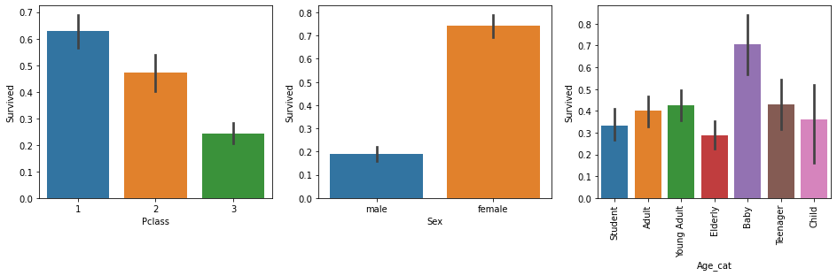
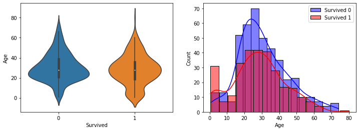
- subplots를 이용하여 여러 연속형 컬럼값들의 Survived 값에 따른 연속 분포도를 시각화
def show_hist_by_target(df, columns):
    cond_1 = (df['Survived'] == 1)
    cond_0 = (df['Survived'] == 0)

    for column in columns:
        fig, axs = plt.subplots(nrows=1, ncols=2, figsize=(12, 4))
        sns.violinplot(x='Survived', y=column, data=df, ax=axs[0] )
        sns.histplot(df[cond_0][column], ax=axs[1], kde=True, label='Survived 0', color='blue')
        sns.histplot(df[cond_1][column], ax=axs[1], kde=True, label='Survived 1', color='red')
        axs[1].legend()

cont_columns = ['Age', 'Fare', 'SibSp', 'Parch']
show_hist_by_target(titanic_df, cont_columns)
-> 왼쪽에는 Violin plot / 오른쪽에는 Survived가 0일 때와 1일 때의 Histogram
[0:07:39] Seaborn Box 플롯과 Scatter 플롯 실습
box plot
- 4분위를 박스 형태로 표현 (25%, 50%, 75%, outlier)
- x축에 이산값을 부여하면, 이산값에 따른 box plot을 시각화해줌
sns.boxplot(y='Age', data=titanic_df)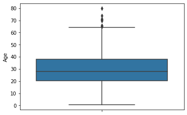
sns.boxplot(x='Pclass', y='Age', data=titanic_df)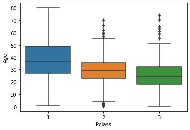
scatter plot
- x,y축이 보통 연속형일 때 사용
- 산포도를 시각화함 (얼마나 퍼져있냐)
- 튀는 데이터를 잘 확인할 수 있음
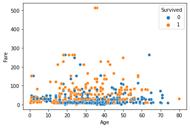
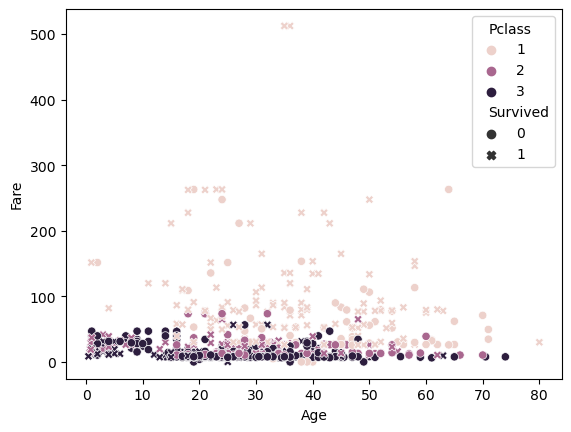
sns.scatterplot(x='Age', y='Fare', data=titanic_df)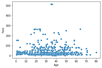
sns.scatterplot(x='Age', y='Fare', data=titanic_df, hue='Pclass')-> hue를 통해 breakdown(쪼개다) 할 수 있음
sns.scatterplot(x='Age', y='Fare', data=titanic_df, hue='Pclass', style='Survived')-> style 속성을 통해 더 많은 정보를 나타낼 수 있음
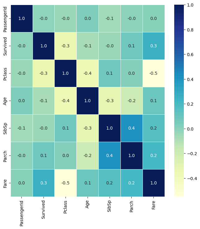
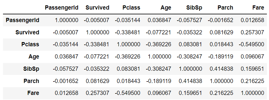
[0:09:05] Seaborn 상관 Heatmap 실습
상관 Heatmap
- 컬럼간의 상관도를 Heatmap 형태로 표현
- 수치가 마이너스면 반비례라는 뜻임
- 절대값이 높을 수록 상관관계가 높음
titanic_df.corr()-> 수치로 반환 (숫자형 column에 대해서만)
plt.figure(figsize=(8, 8))

# DataFrame의 corr()은 숫자형 값만 상관도를 구함.
corr = titanic_df.corr()

sns.heatmap(corr)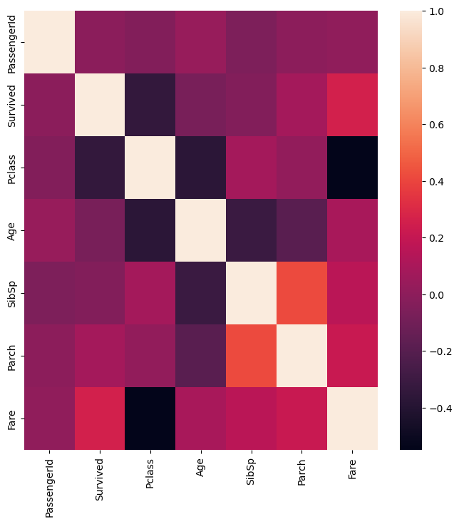
plt.figure(figsize=(8, 8))

# DataFrame의 corr()은 숫자형 값만 상관도를 구함.
corr = titanic_df.corr()

sns.heatmap(corr, annot=True, fmt='.1f',  linewidths=0.5, cmap='YlGnBu')
# annot -> 값 표시 / fmt -> 소수점 자리 설정 / cbar -> 옆에 뜨는 색 표시 / linewidths -> 구분선 표시 / cmap -> 색 설정
-> annot -> 값 표시 / fmt -> 소수점 자리 설정 / cbar -> 옆에 뜨는 색 표시 / linewidths -> 구분선 표시 / cmap -> 색 설정